Combining nilearn plots
Visual presentation of brain results should be clear for the viewer, but the exact kind of a plot will depend on the result presented (just a single, super-important cluster? a scattering of voxels? widespread network?). Still, preferences vary, and finding the right way to present a given result may feel almost like finding one's own artistic voice.
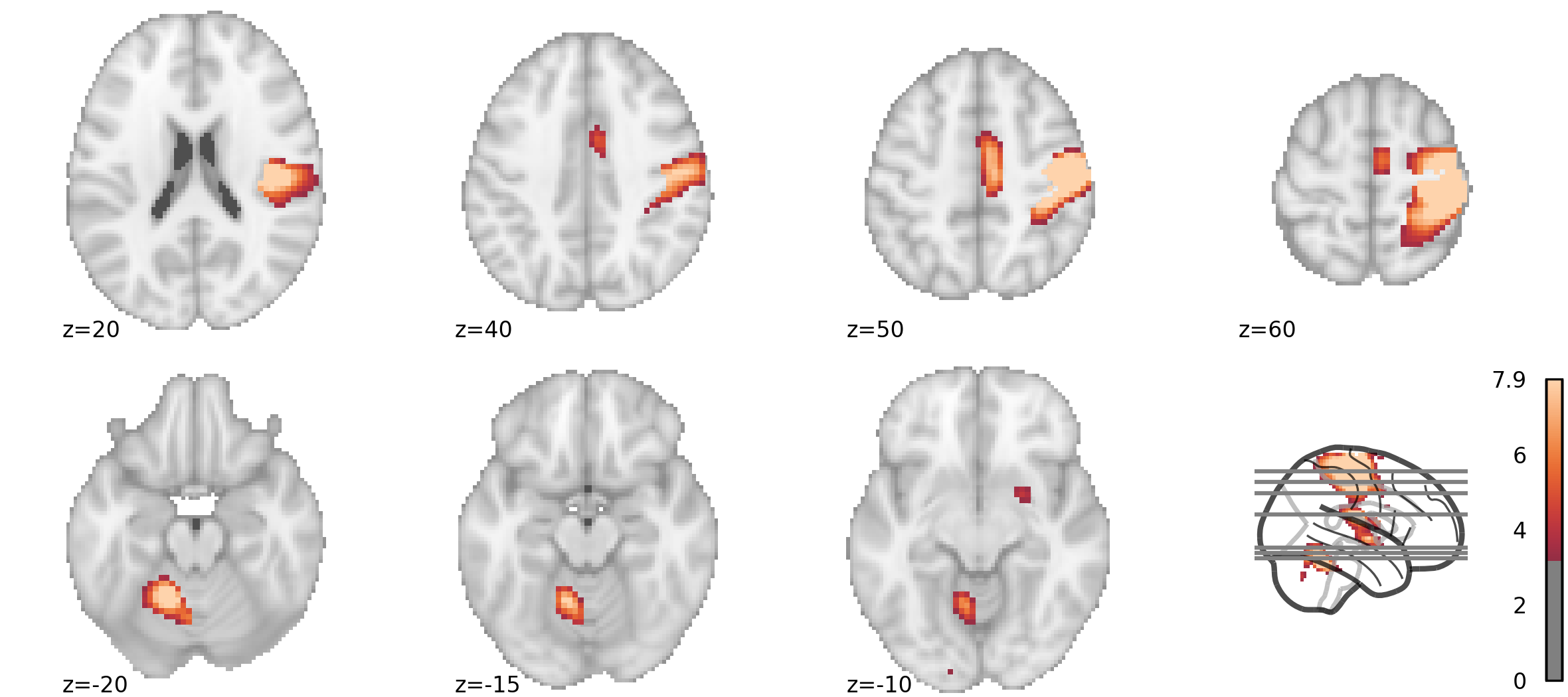
For the last given example (widespread activation of multiple brain regions), I have grown to prefer a montage of slices, accompanied by a glass-brain showing selected cuts.
Below I will show how to do it using the plotting sub-module from nilearn. Combining several plots efficiently wasn't difficult to figure out thanks to nilearn's documentation, but it required a tiny bit of hackery. Also, I didn't find examples which cover combined plots directly, so here's hoping that I can fill a gap (and perhaps encourage you to use nilearn's plotting functions).
My goal is to create, with a block of code, a complete figure which won't need editing (such as merging or scaling) in external programs. This way, any changes made between the initial and final version (e.g. change of slice coordinates) will be simple to make and won't consume much time - a huge advantage of creating figures programatically.
Nilearn plotting: basic elements
For fMRI activations, nilearn provides the plot_stat_map function (docs). By default, it shows 3 cuts (axial, coronal, and saggital); several other display modes can be used. When a single direction of cuts is used, multiple slices are arranged in one row; for my desired view I will be aiming for two such rows.
  plotting.plot_stat_map(stat_map, threshold=3.21, display_mode='z',
	   cut_coords = [-15, -5, 15, 45])
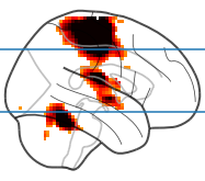
The glass brain can be plotted with the plot_glass_brain function (docs). Conveniently, the plot axes behave as expected, so in a basic version you can simply call axhline from pyplot without any hassle, and give it millimeter coordinates (as a side note, you can set the first argument to None to plot just the glass brain, without any blobs).
  plotting.plot_glass_brain(stat_map, threshold=3.21, display_mode='x')
  plt.axhline(-15)
  plt.axhline(45)
Crucially, both functions accept the axes optional parameter (from the docs):
axesmatplotlib axes or 4 tuple of float: (xmin, ymin, width, height), optionalThe axes, or the coordinates, in matplotlib figure space, of the axes used to display the plot. If None, the complete figure is used.
I will use this to build the combined figure. Using coordinates rather than matplotlib axes as input is more practical and allows more control over the figure (I tried creating an uneven subplot grid, but ended up with oddly large margins).
Building the figure, beginning to end
These are the packages which I'll be using.
  from nilearn import datasets, image, plotting
  from matplotlib import pyplot as plt  # basic plotting functions
  from matplotlib import rc             # additional styling
  import numpy as np                    # for working with image data
  import seaborn as sns                 # nice colormaps
Data loading and preparation
When choosing the data used for plotting, I will follow examples from nilearn and use the "neurovault motor task" from nilearn.datasets (when working with my own data, I would just load my own statistical map).
  motor_images = datasets.fetch_neurovault_motor_task()
  img_path = motor_images.images[0] # or use path to own data
  orig_img = image.load_img(img_path)
Since usually I am interested only in the positive contrast values, I will also clip the negative values from the image (for this particular contrast, left vs right button press, this hardly makes any sense, but it would be desired in many cases). This is also a simple way to guarantee that nilearn will include just the positive values on the colorbars.
stat_map = image.new_img_like(orig_img, np.clip(orig_img.get_fdata(), 0, None))Some more preparation: colormap & font
Before starting with the actual figure, let's prepare a colormap that is different from the default. I like the icefire palette from seaborn - it is perceptually uniform, and I think it looks better than nilearn's default cold_hot (you can read more in the Choosing color palettes seaborn tutorial).
my_cm = sns.color_palette("icefire", as_cmap = True)What's more, while plot_stat_map always uses cold_hot as default, plot_glass_brain has defaults depending on the background: cold_hot if black, cold_white_hot otherwise. While there is a logic to that, especially when the glass brain is on its own (high values are bright on black background and dark on white), if I kept the default colormaps and a white background for both plot types, I would end up with two distinct color schemes within the figure. When specifying a colormap explicitly, I can keep a single color bar (value ranges should match too).
I will also specify font size using the matplotlib.rc convenience function (which can also be used to set other parameters, eg. font family, by adding more keyword arguments; see Customizing Matplotlib for details).
rc('font', size=8)Size 8 should be fine. Strangely enough, this will affect the colorbars, but not the labels next to slices; those will be changed separately.
Creating an empty figure
At this point, it is good to start thinking about the figure as an empty canvas, which we are going to fill with the brain images. Having to specify the figure size in inches rather than pixels may seem counterintuitive when we are looking at a computer screen, but choosing the right size will guarantee that the output will look good in print (e.g. text size settings will match those on the page).
A4 paper is 210 × 297 mm or 8.3 × 11.7 in. For a full width figure, Elsevier recommends going with 190 mm (7.48 in) and elife recommends 200 mm (7.87 in). Both recommend using a resolution of at least 300 dpi (so a full width column by Elsevier standards will end up 2244 pixels wide).
For this example, I am choosing full page width. For height, I am going to use a bit less than a third of the page. Within this space, I want to include two rows, one with three three brain slices, and one with four (the brains will come out quite large - probably even six slices per row should be perfectly legible), and place a single glass brain on the side, in the row with less slices. Don't be afraid to use a pen and (gridded) paper when planning your figure.
Having made the decision, I can create the figure with the specified size:
fig = plt.figure(figsize=(7.87, 3.5), dpi=300)Plotting: stat map
It's time to start the actual plotting. Let's start with the lower part of the picture, showing three axial slices (explanations below).
sm_lower = plotting.plot_stat_map(
    stat_map_img = stat_map,
    threshold = 3.21,
    display_mode = 'z',
    cut_coords = [-20, -15, -10],
    annotate = False,
    figure = fig,
    axes = (0, 0, 0.75, 0.48),
    cmap = my_cm,
    colorbar = False,
)

sm_lower.annotate(left_right=False, positions=True, size=8)
The first argument is the statistical map image to display, and the second is the threshold. Next, display_mode = 'z' means that axial slices will be shown, and cut_coords = [-20, -15, -10] specifies which. I am setting annotate = False (meaning no labels with position and left / right) because this function does not accept arguments for annotation font size (and it doesn't follow the general rc setting); instead, I add annotations afterwards, with a separate function call. With figure = fig, I am telling the function to draw onto the figure created previously. The axes = (xmin, ymin, width, height) is specified in the figure space (1 = entire width / height), allowing us to do this independently from the actual size in inches. For this part, I want to start in the lower left corner (0, 0), use three-quarters of the width (0.75) and almost half the height (0.48, because using all 0.5 made things look overcrowded). I am explicit with the cmap I use, and I don't want to show the colorbar here; I will put one next to the glass brain later on.
The same goes for the upper part of the figure, although this time I am starting a tiny bit above the midline, and using the whole width with axes = (0, 0.51, 1, 0.48) to show four slices:
sm_upper = plotting.plot_stat_map(
    stat_map_img = stat_map,
    threshold = 3.21,
    display_mode = 'z',
    cut_coords = [20, 40, 50, 60],
    annotate = False,
    figure = fig,
    axes = (0, 0.51, 1, 0.48),
    cmap = my_cm,
    colorbar = False,
)

sm_upper.annotate(left_right=False, positions=True, size=8)
Plotting: glass brain
Now comes the time for the glass brain. Since I used axial slices before, I will mark them on the sagittal view: display_mode='x'. I will put the glass brain on the lower right: axes=(0.8, 0, 0.2, 0.48) (proportions for the glass brain are slightly different, and 0.2 width seems just right). Again, I am explicit with cmap, but this time I do want to show the colorbar.
gb = plotting.plot_glass_brain(
    stat_map,
    threshold=3.21,
    display_mode='x',
    figure = fig,
    axes=(0.8, 0, 0.2, 0.48),
    cmap = my_cm,
    colorbar=True,
)
Note that because we used the same colormap across all three figure parts, and plot_stat_map scales itself to the maximum of the entire image regardless of selected slices, this colorbar will be valid for the entire figure. If we were showing positive and negative values, we would also gave to set plot_abs=False for the glass brain. To make sure that the scales match, you can try enabling the colorbar everywhere before making the final version.
And here comes the last tricky part: marking the slices. When placed onto a figure, the glass brain creates its own set of GlassBrainAxes (three if all slices are shown; only one in our case). This means we cannot work directly with the object we created, gb. Before adding lines, we need to unpack it a little to get to the relevant Axes object: gb.axes[<slice>].ax is what we want. We will get the start and end points with get_object_bounds() (we could also know the MNI brain size by heart and just hardcode the values) and draw all lines at once with hlines.
bounds = gb.axes['x'].get_object_bounds()
gb.axes['x'].ax.hlines(
    y = [-20, -15, -10, 20, 40, 50, 60],
    xmin = bounds[0],
    xmax = bounds[1],
    color='gray')
One final note: in practice, I would store the cut coordinates in a list and refer to it both when plotting brains and drawing lines to minimze errors. However, for demonstration I decided to be explicit.
Saving
And finally comes the last part: saving. We can do this with one siple call, and we can specify either png or pdf extension to determine the file format.
fig.savefig('/my/path/figure.png')This is the result:
